Trivora
Trivora is not just a name — it's a statement.
Rooted in the fusion of "Tri" (representing the harmony of three pillars: strategy, aesthetics, and emotion) and "vora" (derived from devour, symbolizing our relentless appetite for meaning and depth), Trivora is a creative identity studio committed to thoughtful design.
We believe that great design is not just visual.
It is deliberate, strategic, and deeply human.
It is deliberate, strategic, and deeply human.
Trivora crafts brand identities that:
Think before they speak
Challenge the ordinary
Reflect the soul of a vision
Every project begins with intention. Every form follows clarity. Every word echoes purpose.
Welcome to Trivora —
A space where elegance meets intellect.
Where design doesn’t just look good, it thinks.
A space where elegance meets intellect.
Where design doesn’t just look good, it thinks.
Core Identity
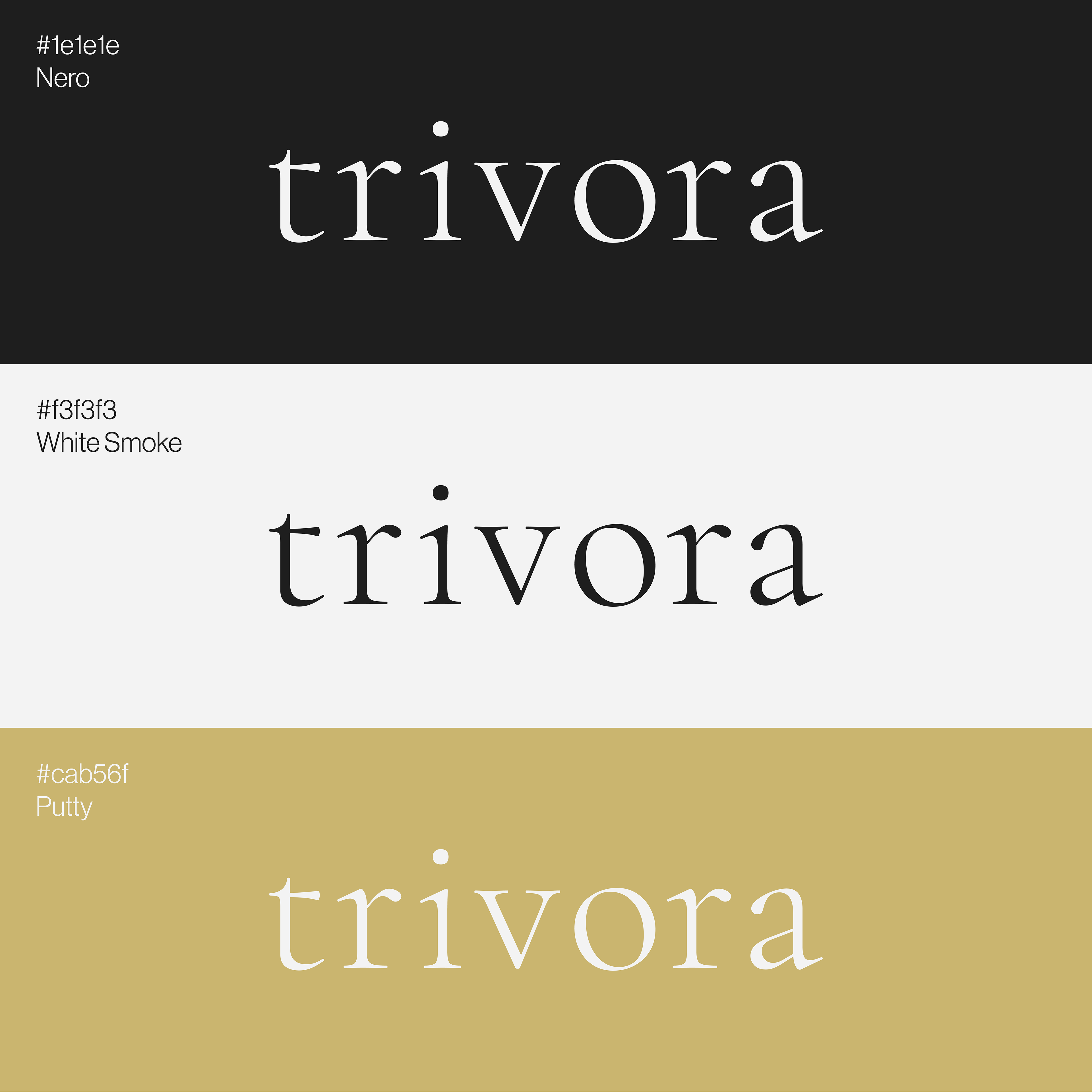
The Trivora logo is designed with timeless clarity.
Its custom typography is paired with a minimal, strategic color palette:
Nero #1E1E1E – authority and elegance
White Smoke #F3F3F3 – purity and balance
Putty #CAB56F – prestige and distinction
Its custom typography is paired with a minimal, strategic color palette:
Nero #1E1E1E – authority and elegance
White Smoke #F3F3F3 – purity and balance
Putty #CAB56F – prestige and distinction
Cormorant Garamond
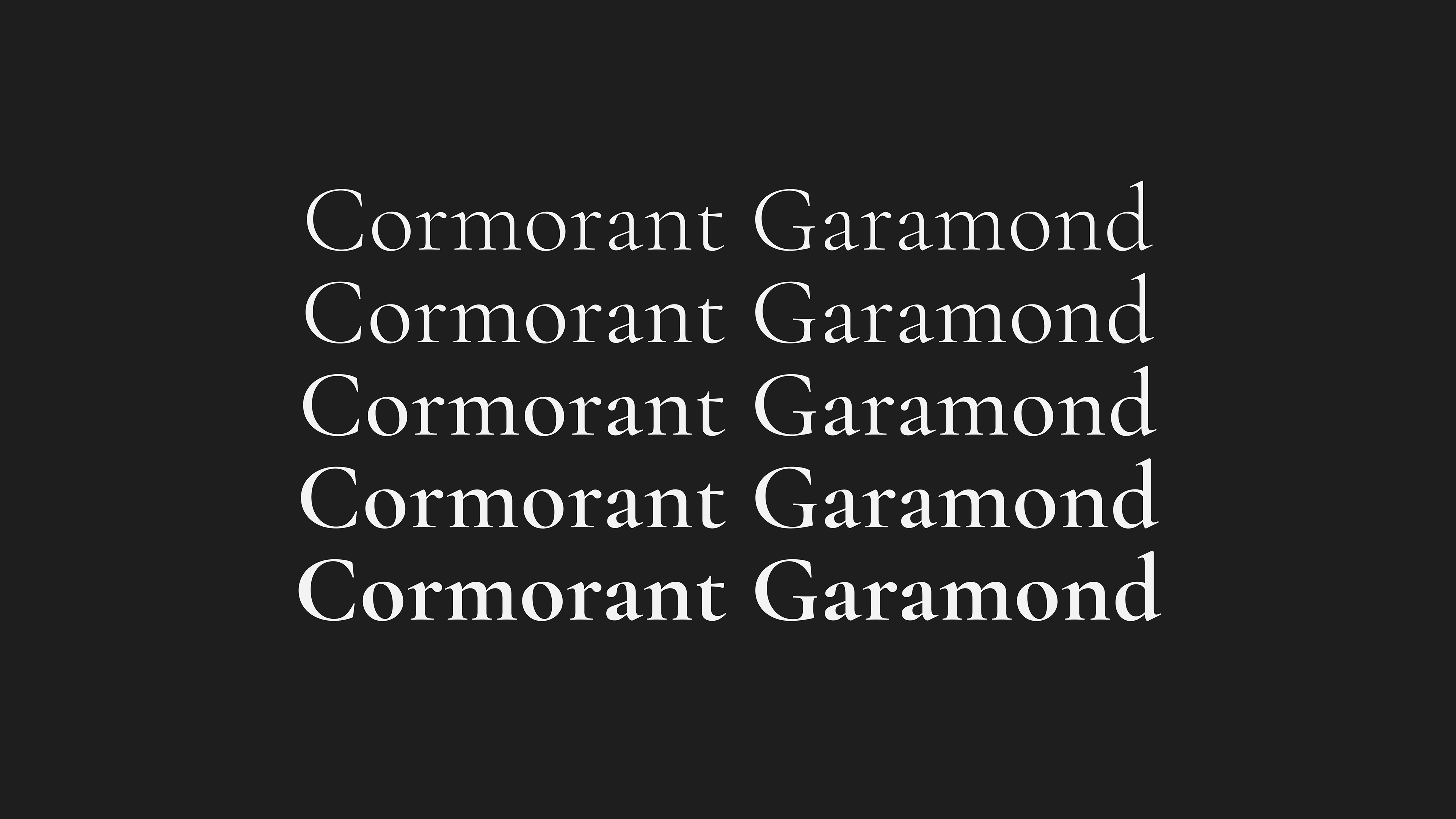
An elegant serif font inspired by classic Garamond structure.
Its sharp contrast and distinctive terminals reflect Trivora's refined and timeless character.
Its sharp contrast and distinctive terminals reflect Trivora's refined and timeless character.
We use Cormorant Garamond across all brand communications — from business cards to presentation decks — to ensure a coherent and sophisticated visual language.
Minimal Professionalism

The Trivora business card focuses on hierarchy and silence.
Serif typography on matte surfaces with soft gold detailing reflects trust and clarity.
Serif typography on matte surfaces with soft gold detailing reflects trust and clarity.
Communication with Character

The envelope showcases Trivora’s visual language in a discreet but bold format.
The oversized typography adds visual rhythm, while contrast and spacing speak subtly.
The oversized typography adds visual rhythm, while contrast and spacing speak subtly.
Welcome Space Branding

The brand’s essence continues into spatial design.
The logo is rendered with high-impact 3D materials, matched with wood and marble textures to radiate sophistication.
The logo is rendered with high-impact 3D materials, matched with wood and marble textures to radiate sophistication.
Street-Level Identity

The outdoor signage presents Trivora with clarity in modern environments.
Clearspace, contrast, and symmetry reinforce credibility at first glance.
Clearspace, contrast, and symmetry reinforce credibility at first glance.
Trivora is a brand that thinks before it speaks — visual, yet strategic.
This identity was designed to reflect not just beauty, but intention.
This identity was designed to reflect not just beauty, but intention.